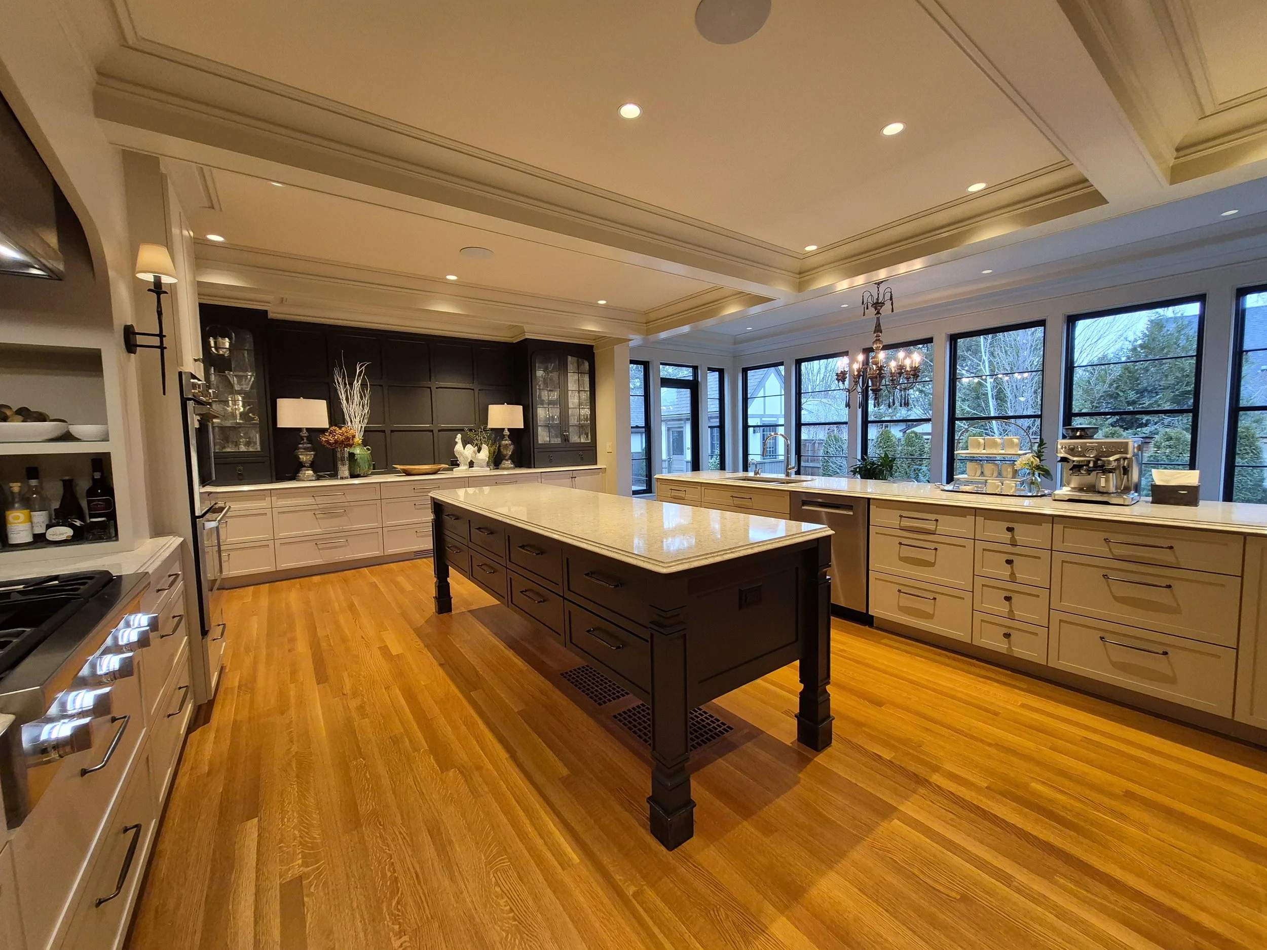
Kitchen Remodeling
Showcase custom cabinetry, upgraded layouts, better storage and high-end finishes with a premium look that matches the quality of the actual work.

This concept gives Integrity Remodeling a cleaner, more premium online presence — with clearer service pages, stronger local SEO, better project storytelling and a more confidence-building path to consultation requests.
Warranty, longevity and process details are highlighted early so visitors feel confident before they even scroll far.
Service copy is trimmed, clearer and structured around the phrases homeowners in Spokane actually search for.
Multiple soft CTAs, visible phone number and consultation prompts guide users naturally toward reaching out.
The same amount of information is reorganized into more readable sections, so the site feels higher-end instead of text-heavy.
Instead of long blocks of copy, the redesigned homepage gives each core service its own space, making it obvious what Integrity Remodeling specializes in and helping homeowners self-identify faster.
Showcase custom cabinetry, upgraded layouts, better storage and high-end finishes with a premium look that matches the quality of the actual work.
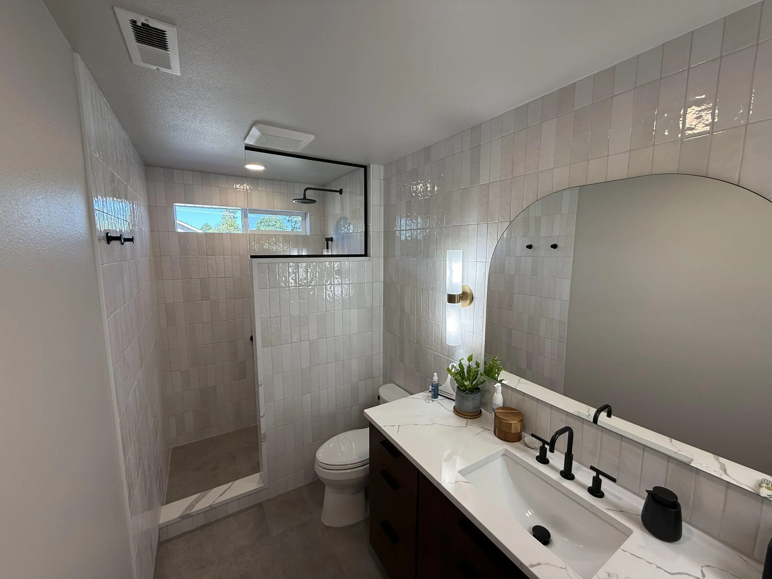
From elegant primary bathrooms to practical refreshes, this layout makes the work look refined while keeping the messaging concise and homeowner-focused.
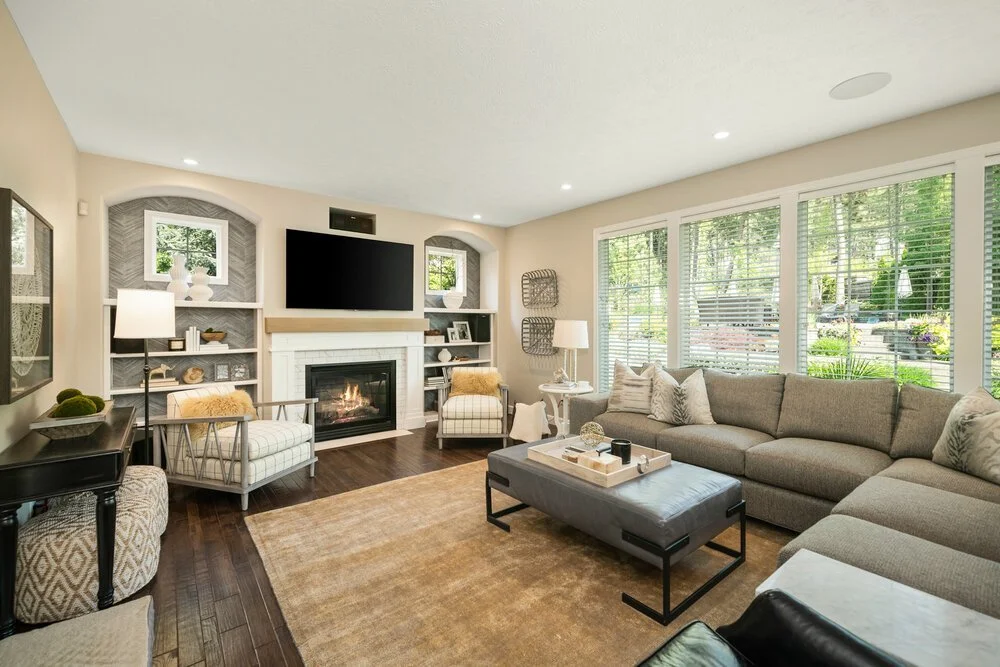
Additions, custom cabinetry and integrated remodels are grouped into a cleaner narrative that better reflects a higher-end design-build capability.
This concept doesn’t remove substance — it reorganizes it. Visitors quickly understand the quality of work, the areas served, the kind of projects handled and why the company is trusted, without feeling overloaded by long text sections.
Testimonials, rating signals and years in business show up earlier and more clearly.
Project imagery gets room to breathe, which immediately elevates the perceived quality.
The visual treatment aligns better with custom kitchens, bathrooms and luxury remodels.
Headlines, cards and spacing make the content feel easier to absorb on desktop and mobile.
The hero now communicates quality, longevity and a clearer value proposition instead of relying on a single large image and heavier paragraphs.
Core services, specialties and featured project categories are easier to understand at a glance.
Review highlights and trust signals provide social proof without making the page feel cluttered or repetitive.
Consultation CTAs appear in the right places, making the experience feel helpful rather than pushy.
These are the same kinds of projects already shown on the current site — simply presented in a way that feels more editorial, more premium and easier to explore.
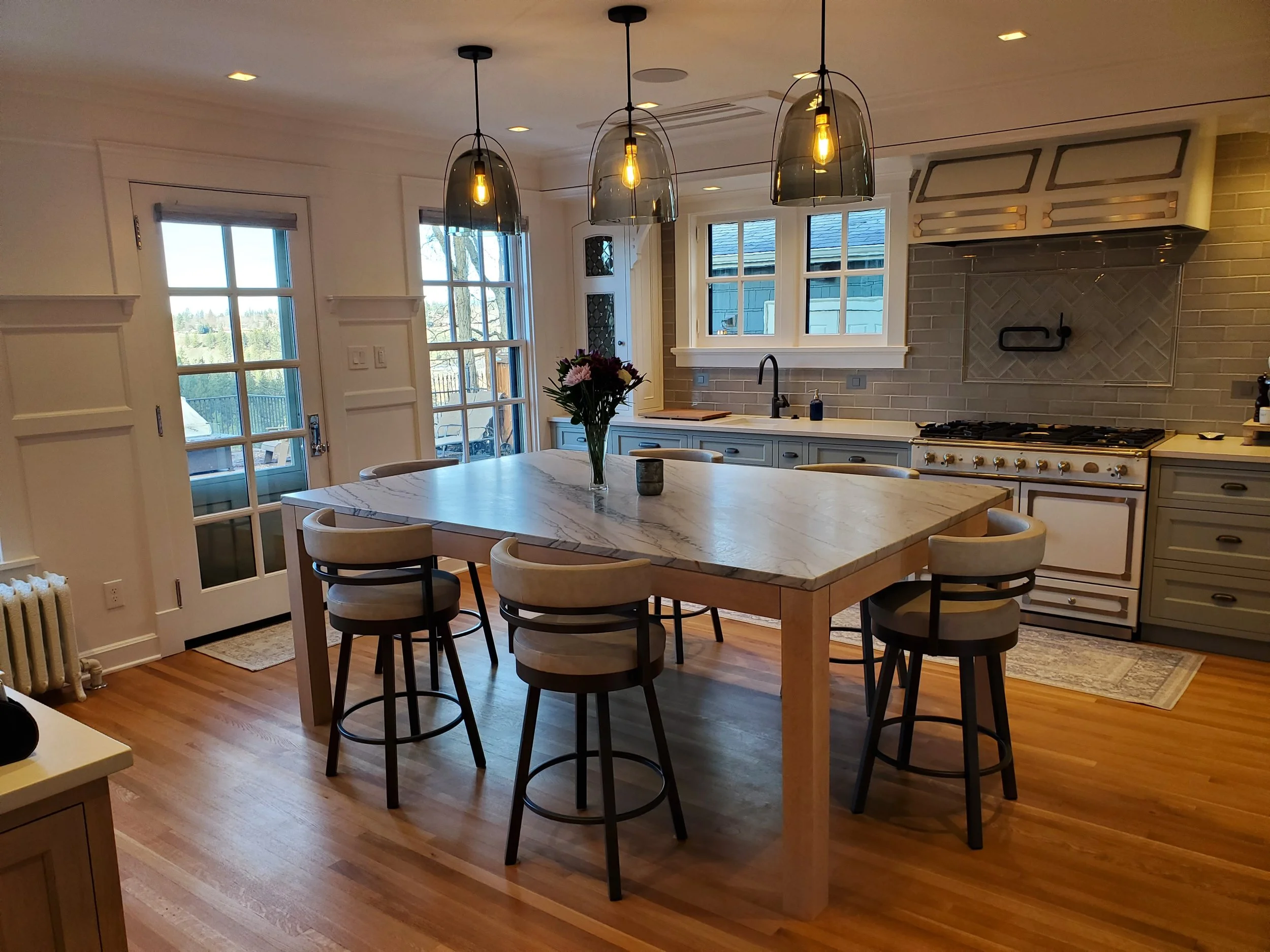
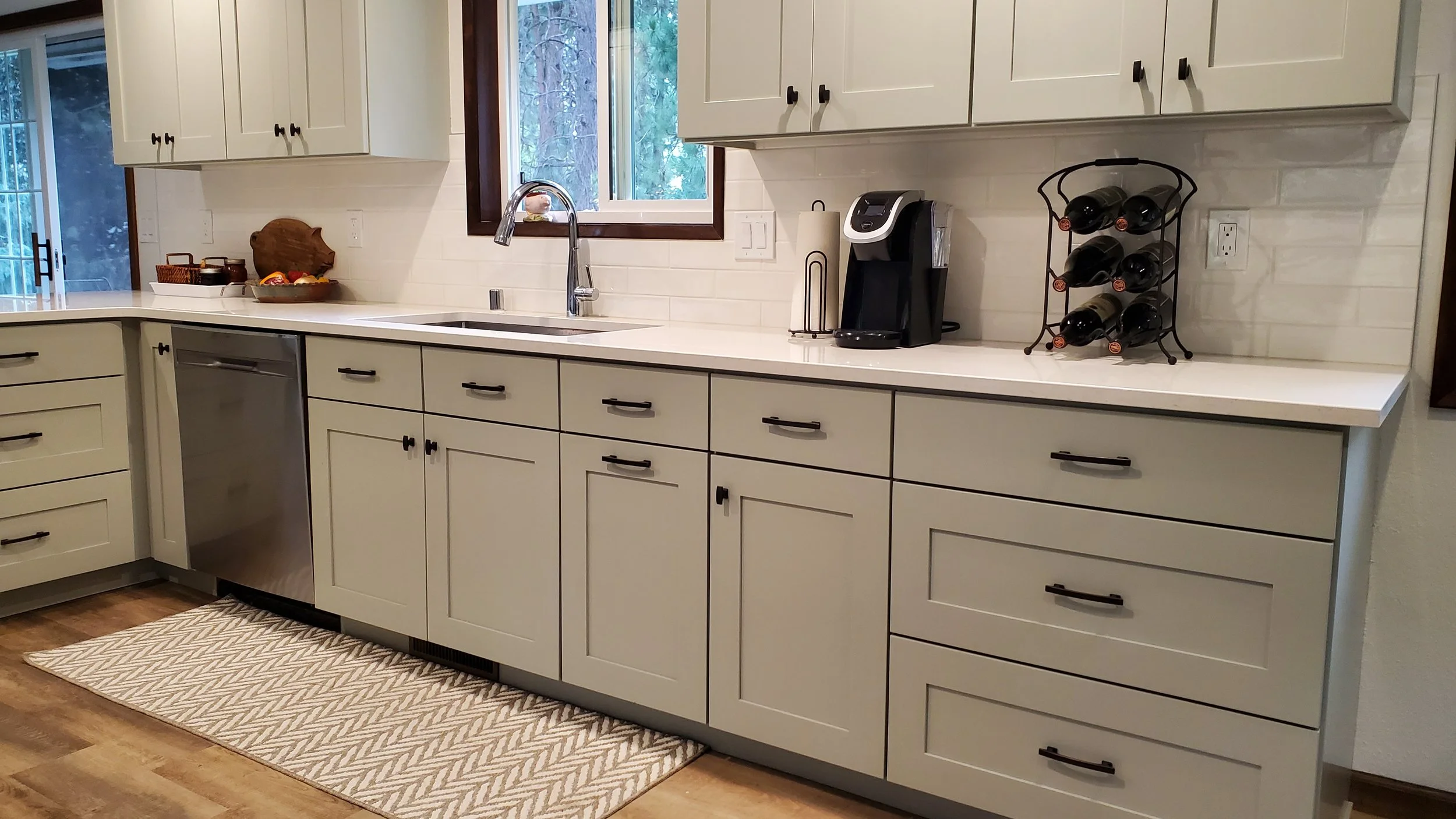
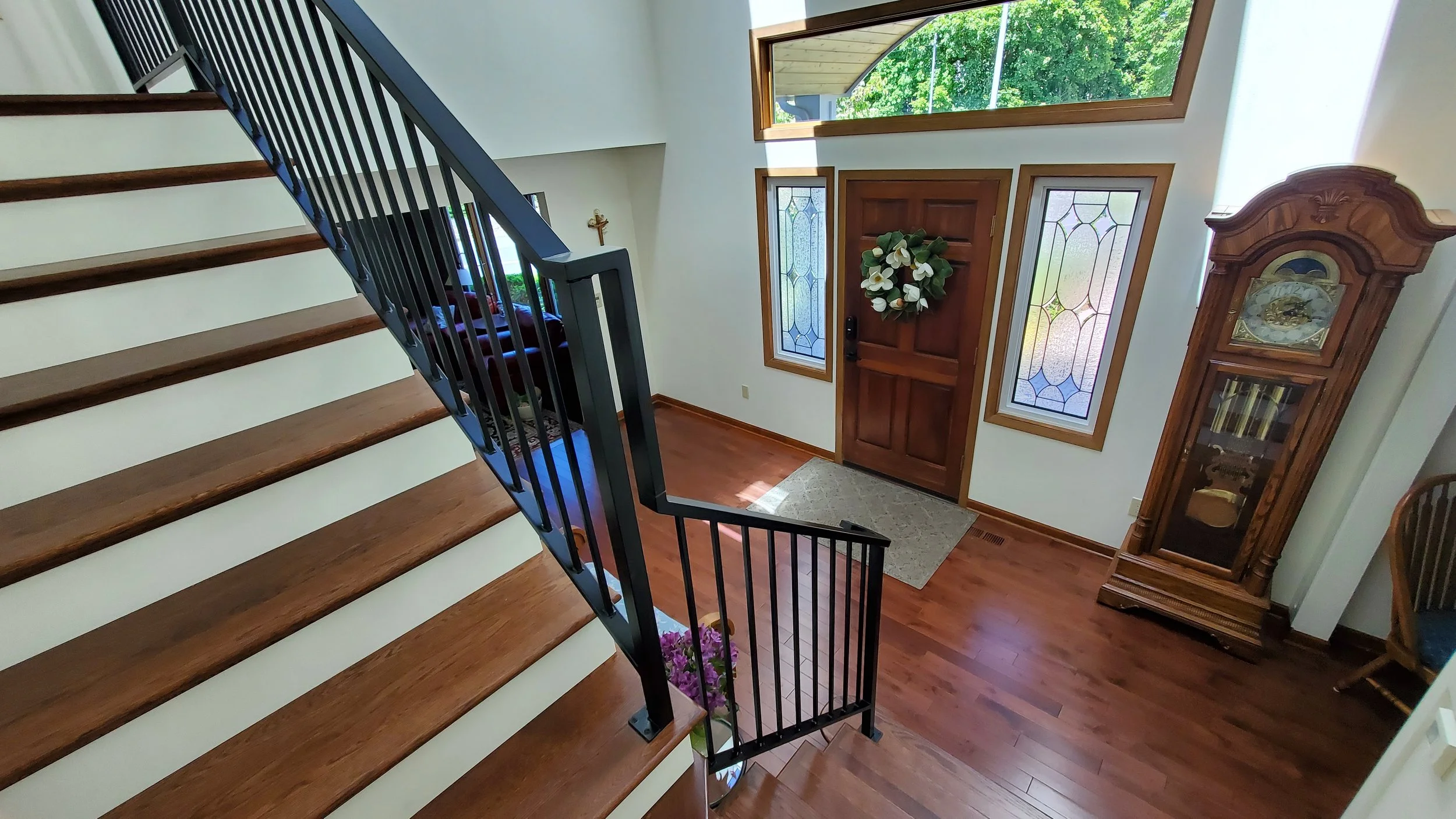
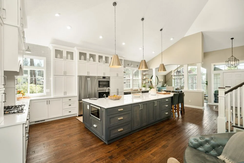
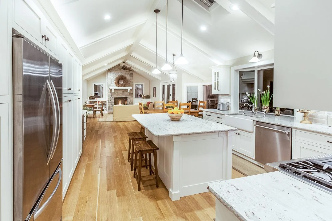
The current business already has a strong reputation. This concept brings that social proof forward with dedicated review cards, a cleaner summary and better placement throughout the page — instead of leaving credibility buried or easy to miss.
When homeowners are considering a kitchen, bath or whole-home remodel, they are not only buying craftsmanship — they are buying reliability, communication and confidence. Featuring review highlights near the project work helps support that buying decision in a more natural way.
“Integrity Remodeling completely transformed the first floor of our 1910 home. The finished result was even better than we imagined.”
Jerry & Susan Zieg Testimonial featured on the company website“We have entrusted our back-to-the-studs kitchen and bath remodel to Integrity and wouldn’t consider going anywhere else.”
Kris Busko Testimonial featured on the company website“Their attention to detail and follow-through are exceptional. High quality and obvious pride of workmanship.”
Homeowner testimonial Summarized from the review section on the current siteThe redesign keeps service depth but breaks it into clearer segments, which helps both users and search engines. Kitchen remodeling in Spokane, bathroom remodeling, cabinetry and whole-home remodeling can each become stronger internal landing pages supported by this homepage.
Instead of a long stream of gallery images and dense copy, the page is organized into visual chapters: hero, trust, services, process, projects, reviews, FAQ and CTA. That creates momentum and makes the brand feel more intentional and more premium.
FAQ content is a good place to reinforce professionalism while also capturing informational search intent. Keeping it concise helps the page feel cleaner, while still addressing common homeowner questions about remodeling projects.
Talk About Your ProjectThe company is publicly presented as a Spokane remodeler focused on kitchens, bathrooms, custom cabinetry and larger remodeling projects for homeowners seeking quality craftsmanship.
It uses stronger typography, more refined spacing, better image presentation, clearer section hierarchy and more intentional calls to action — all without losing the substance of the original site.
Yes. The concept pulls review-style trust signals and testimonials forward so visitors see them earlier, instead of having to search for them or miss them entirely.
Absolutely. This homepage can be expanded into a complete build with dedicated service pages, project pages, local SEO improvements, lead capture forms and performance optimization.
If you like the direction, this concept could be turned into a full website experience with deeper service pages, better project organization and a stronger lead-generation flow.